
The Project
Katanou Was SASU is a Senegalese company specializing in construction and real estate. At launch, the company needed a strong visual identity and a set of professional communication materials to establish itself in a highly competitive market.
What We Delivered
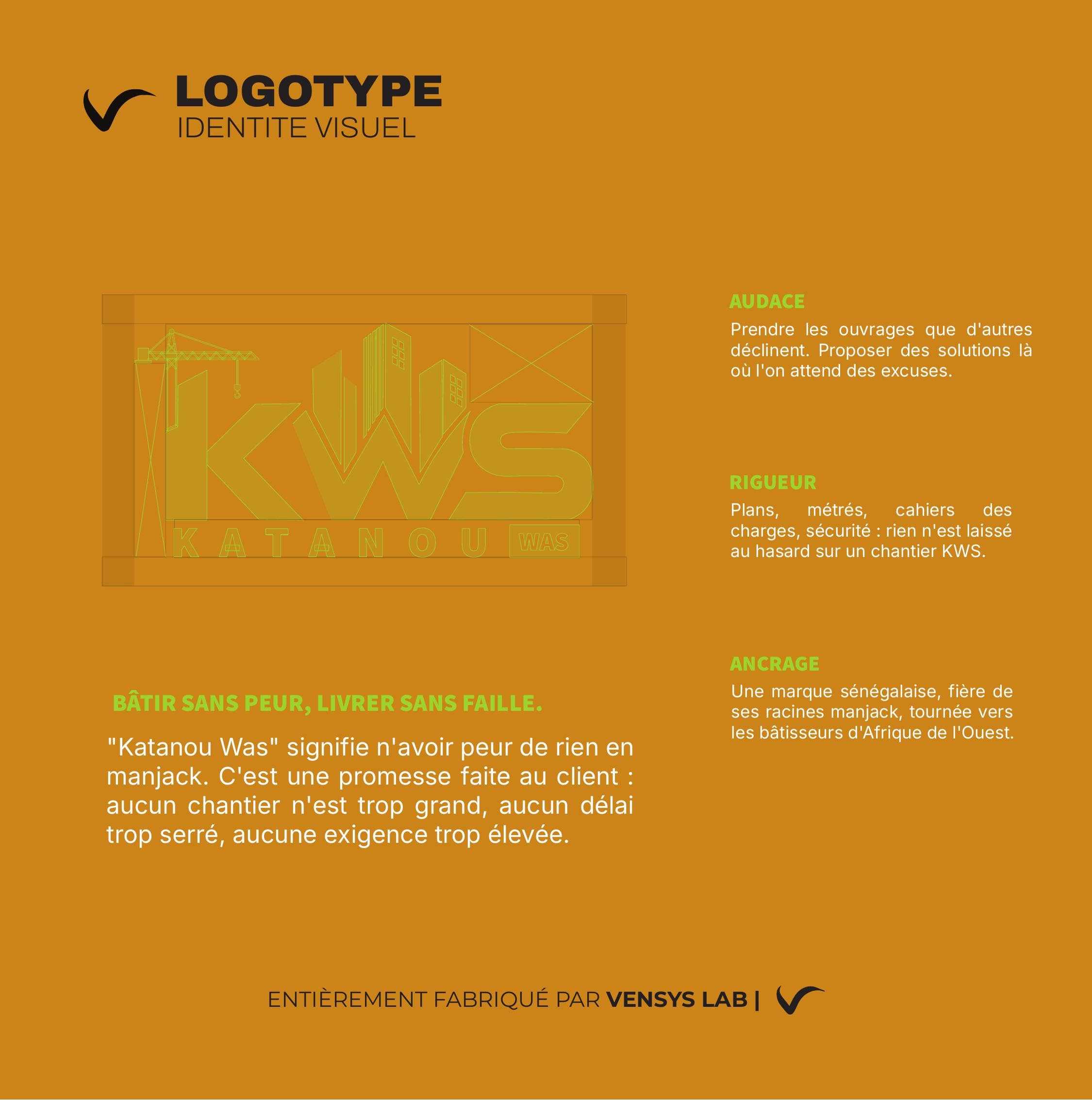
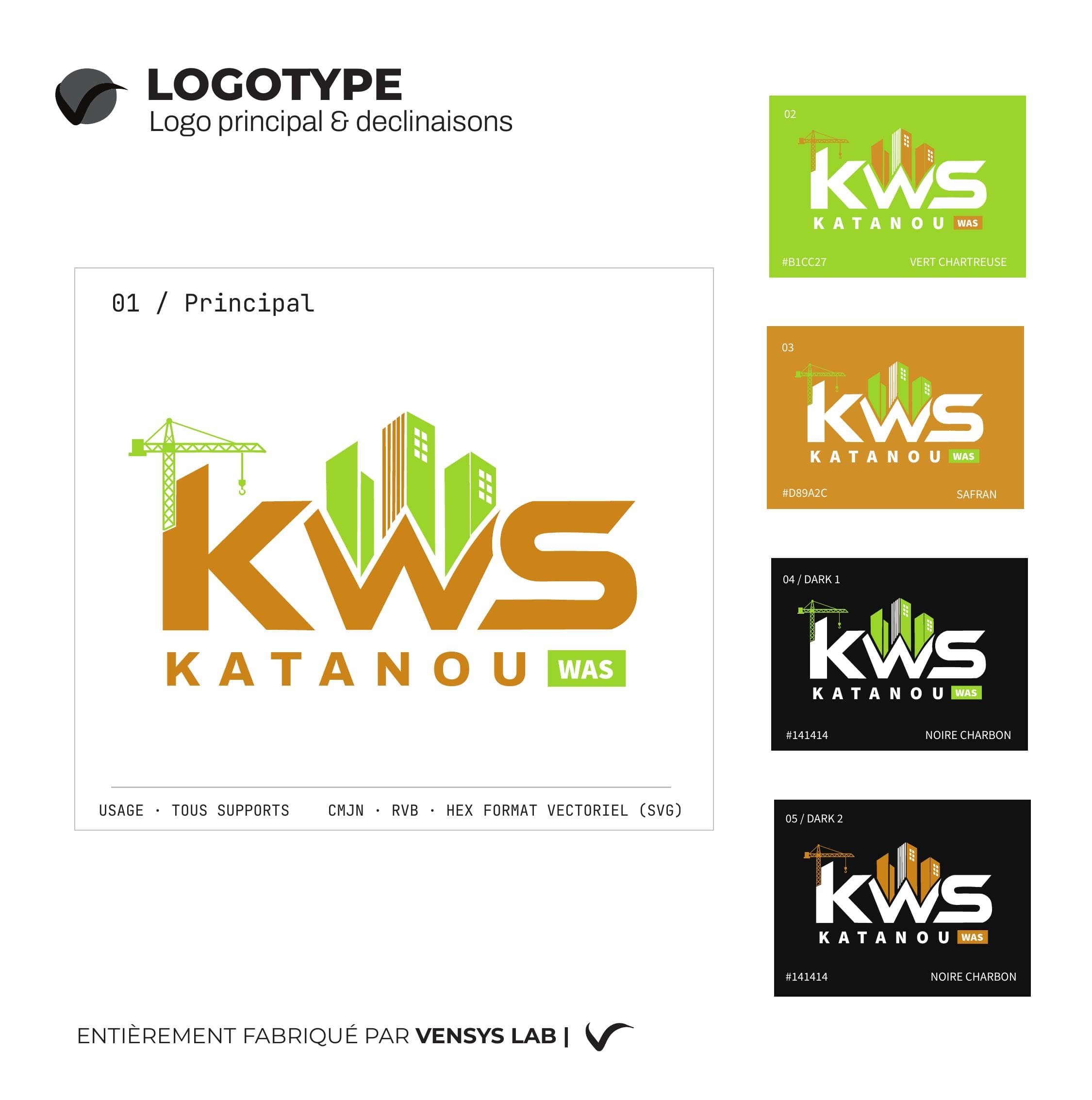
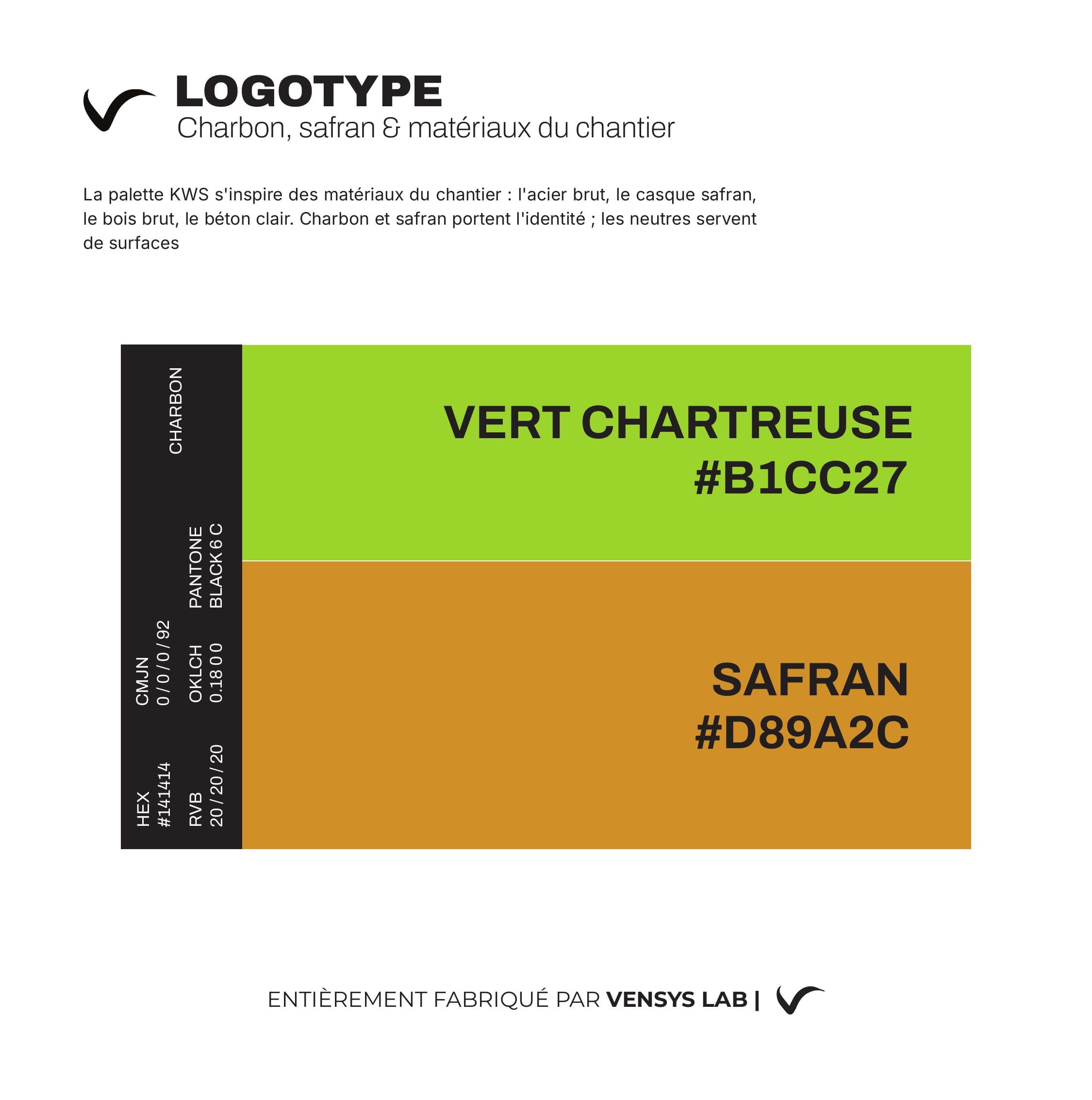
Logotype
Design of a distinctive logotype built around the initials KWS, incorporating construction visual elements (crane, buildings) to instantly communicate the company's activity.
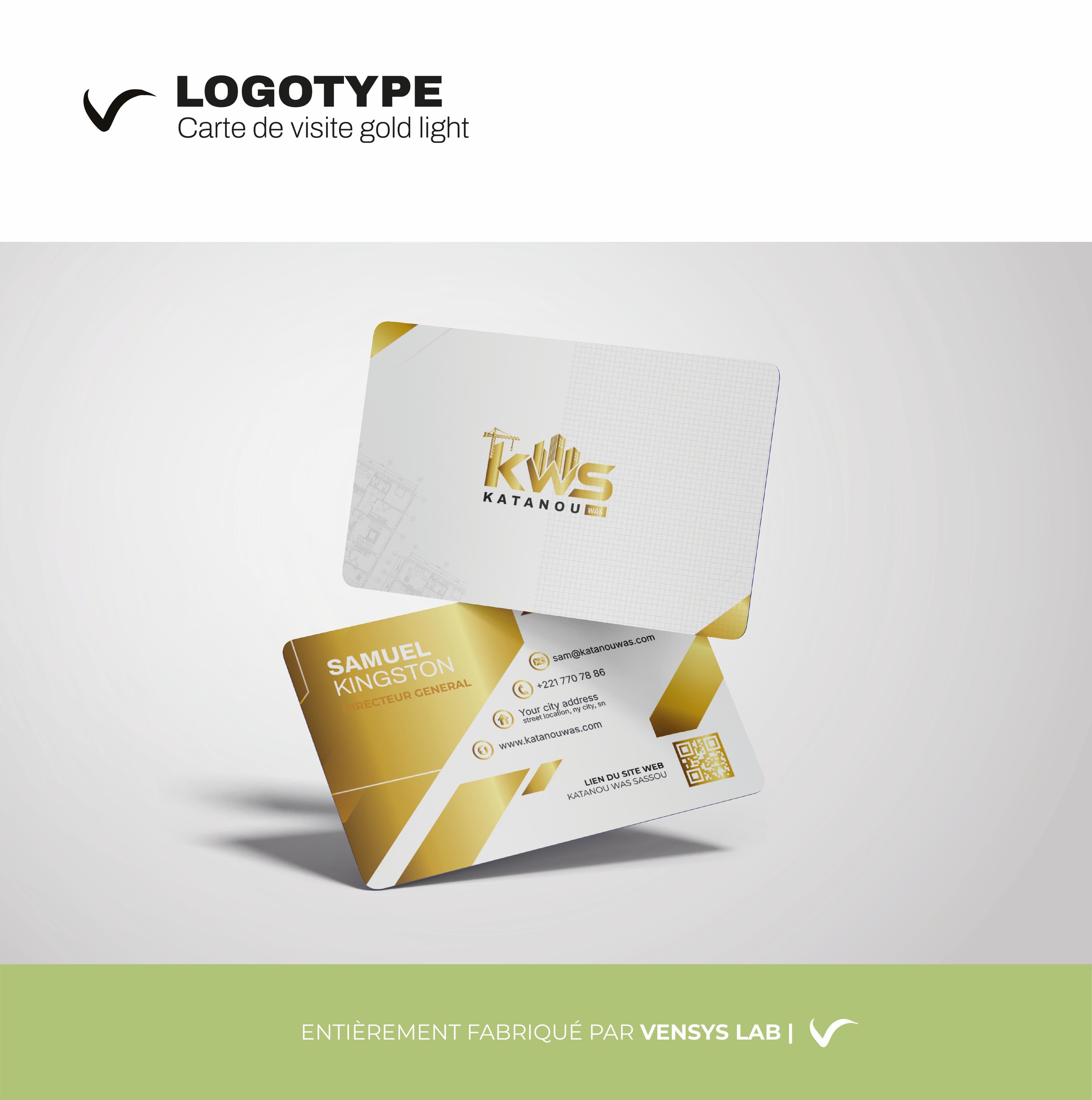
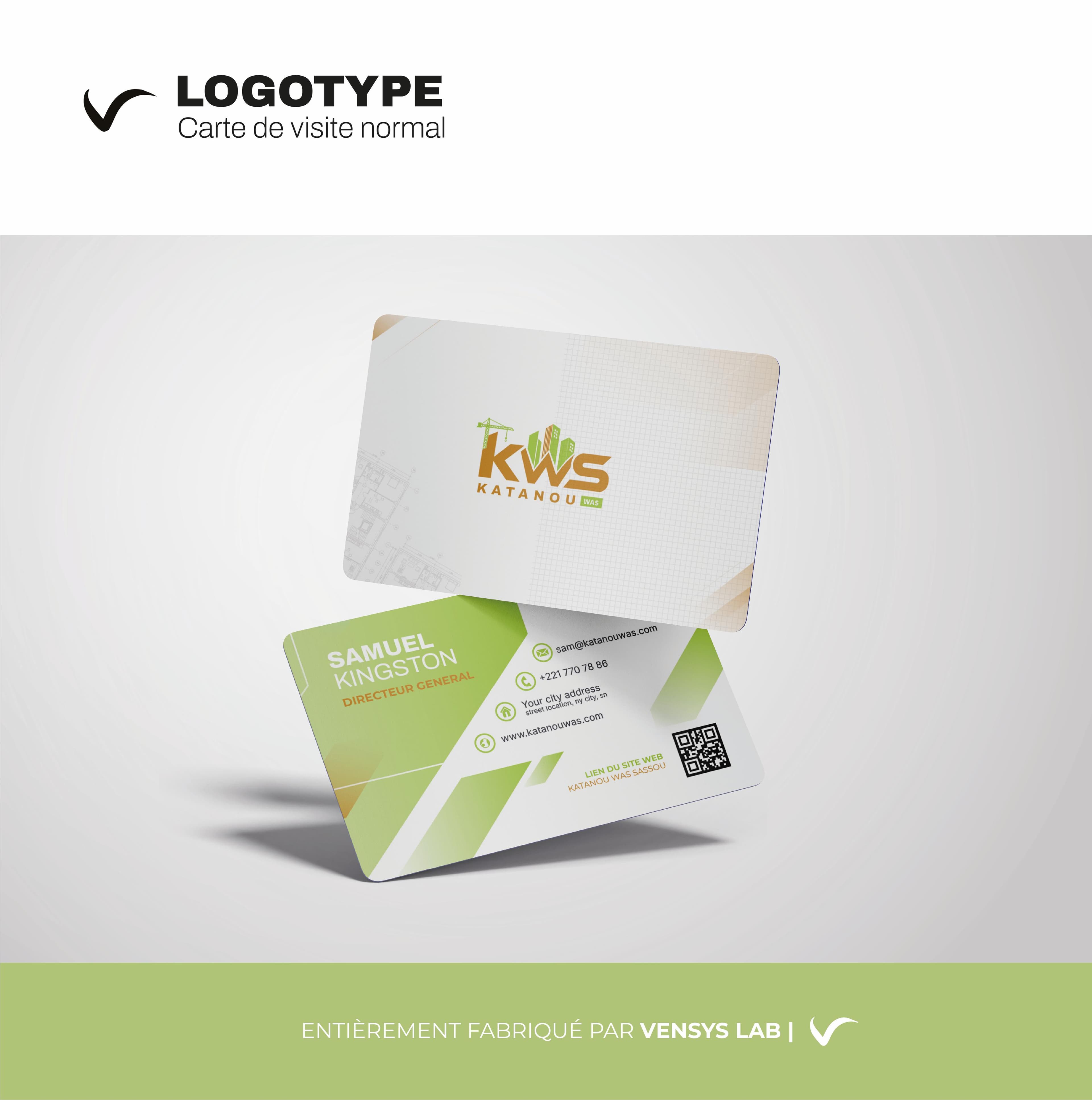
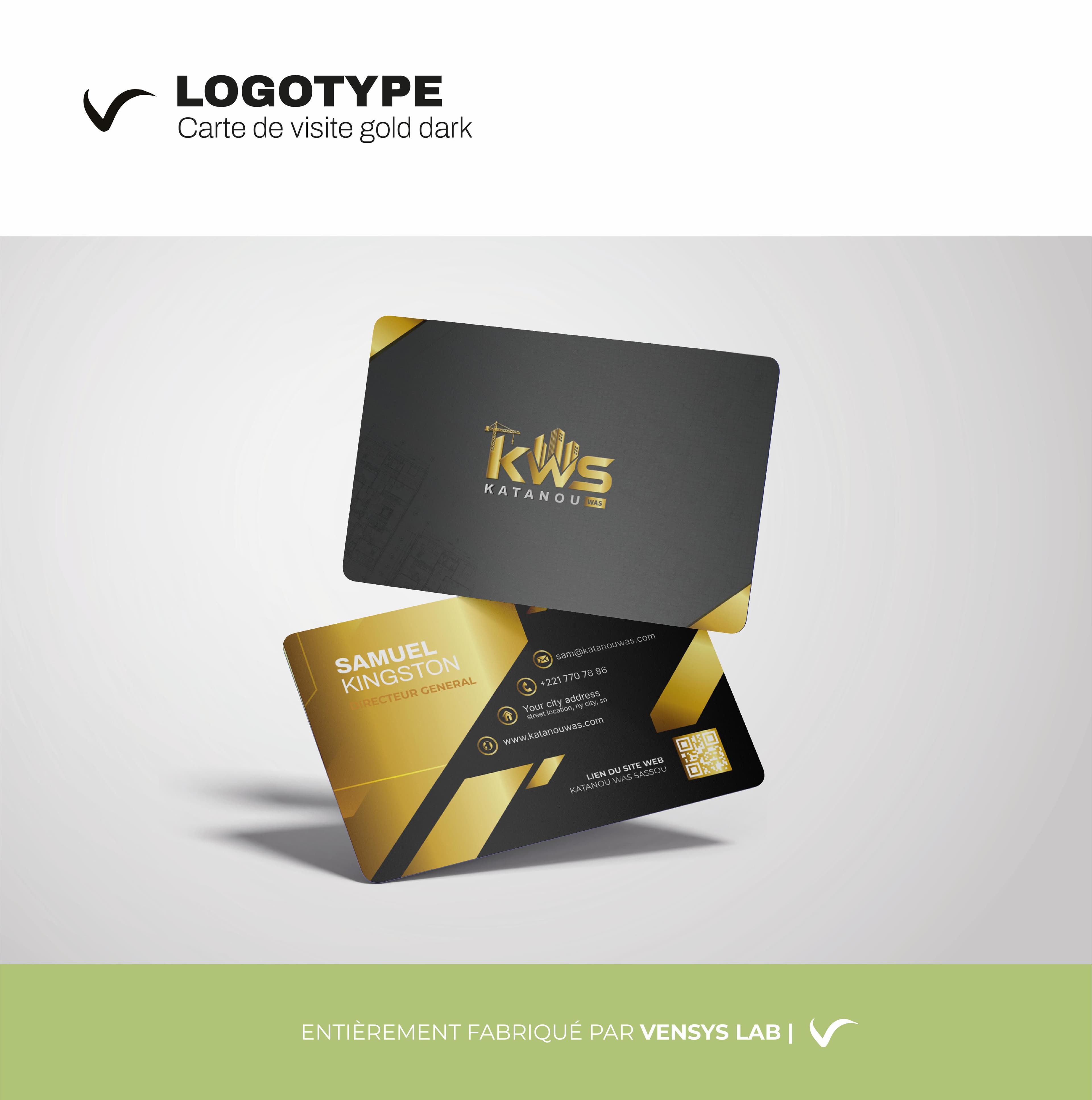
Business Cards — 3 Variations
Three business card versions were created to suit different representation contexts:
- Gold Light — white background with gold accents, elegant and premium
- Normal — green and beige palette, approachable and professional
- Gold Dark — black background with gold finishes, high-end and impactful
Each version includes a QR code linking to the company website.
Construction Site Cards
Design of site panels and construction cards in Katanou Was brand colors, enabling immediate visual identification on building sites.
Website
Institutional website development in progress using Next.js to showcase services, projects, and facilitate contact.
Tech Stack
- Design: Figma, Illustrator
- Print: Business cards, construction site materials
- Web: Next.js, Tailwind CSS (in progress)